You probably spend a lot of time doing a variety of things during a typical week. But do you have any idea how much time you spend eating or watching television during the week? In this activity, you will use a spreadsheet to add up the hours you spend eating, sleeping, watching television, and doing everything else you like to do.
A spreadsheet is a computerized chart, that can automatically do calculations whenever you change the information in the chart. Most spreadsheets can also create a variety of charts and graphs to visually display information.
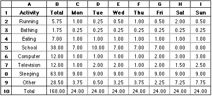
Your finished spreadsheet should look something like the following:
This is how I spend my week. Your spreadsheet should show how you spend your week!
You will need to enter formulas in rows 9 and 10 and column B. Each formula will tell the spreadsheet to do a computation and display the result in that cell. Here are some of the formulas you might use:
|
cell B2 |
=SUM(C2:I2) |
|
cell B3 |
=SUM(C3:I3) |
|
cell C9 |
=24 - SUM(C2:C8) |
|
cell D9 |
=24 - SUM(D2:D8) |
|
cell C10 |
=SUM(C2:C9) |
|
cell D10 |
=SUM(D2:D9) |
You can use the Fill Across and Fill Down commands to avoid typing a lot of formulas that are all but identical. These commands copy the contents of a cell across a row or down a column, automatically changing formulas as you would usually expect.
For example, when you fill down column B, you will get these formulas:
|
cell B2 |
=SUM(C2:I2) |
|
cell B3 |
=SUM(C3:I3) |
|
cell B4 |
=SUM(C4:I4) |
And when you fill across row 10, you will get these formulas:
|
cell C10 |
=SUM(C2:C9) |
|
cell D10 |
=SUM(D2:D9) |
|
cell E10 |
=SUM(E2:E9) |
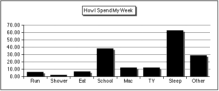
While the numbers in your spreadsheet do tell us how you spend your time, a picture is worth a thousand words. Create a bar graph and a pie chart from your data that show how you spend your time. Your bar graph might look something like this:
And your pie chart might look something like this:

Print a copy of your spreadsheet and your charts.
The Fill Across and Fill Down commands are in the Calculate menu. To use them:
To create a chart:
You may need to experiment a little with the various options to make your chart look just right. You can change many aspects of your chart by double-clicking the chart.
When you create a chart, you usually select cells that include the labels and the data you want in the chart. For example, in the spreadsheet above, you should select columns A and B, rows 2 through 9. The labels in column A will be used as the labels for your chart.
The Fill Across and Fill Down commands are in the Edit menu. To use them:
To create a chart:
You may need to experiment a little with the various options to make your chart look just right. You can change many aspects of your chart by double-clicking the chart.
When you create a chart, you usually select cells that include the labels and the data you want in the chart. For example, in the spreadsheet above, you should select columns A and B, rows 2 through 9. The labels in column A will be used as the labels for your chart.